
Neutral Living Room Ideas: How to Make a Calm Room Feel Warm, Layered and Intentional
A practical guide to neutral living rooms that feel warm rather than flat, using undertones, value contrast, texture, wood, lighting, rugs, art and a small controlled palette.
Neutral rooms look flat when every surface sits at the same visual value and every texture does the same job. Warmth comes from contrast, material variation and a few repeated tones.
Part of the By Sady guide Small Living Room Ideas →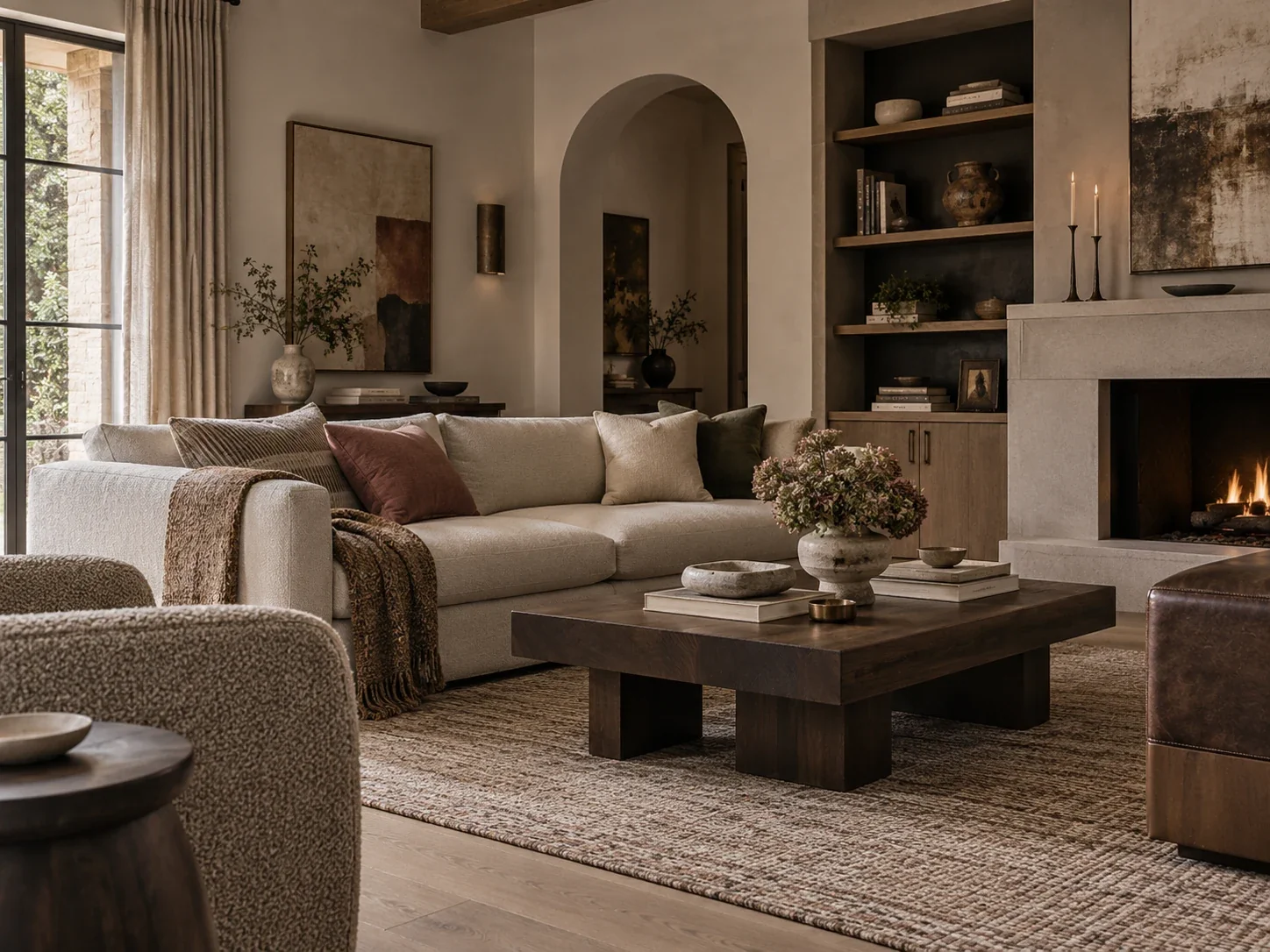
What matters most
- 01
Choose the undertone family before buying several different “neutral” pieces.
- 02
Create contrast with light, mid and dark values so pale rooms do not wash out.
- 03
Use texture to create depth, but repeat a small material vocabulary so the room still feels coherent.
- 04
Let natural wood, stone, woven fibers and warm evening light supply warmth without requiring more color.
- 05
Add personality through art, vintage pieces and one controlled accent instead of decorating every surface.
Neutral is a palette, not a single color
A warm neutral living room is not created by matching every object to the same beige. The room needs variation in value, texture and material while still feeling like the pieces belong to the same family.
Start by choosing a base direction: warm white, cream, beige, taupe, mushroom, greige or a softer stone. Then decide whether the supporting neutrals should lean warm, balanced or cool. This prevents the common problem where one yellow-beige sofa sits beside a blue-gray rug and a pink-beige wall with no intentional relationship.
You do not need perfect undertone matching. You need enough repetition that the differences look chosen rather than accidental.
Build the palette from light, mid and dark values
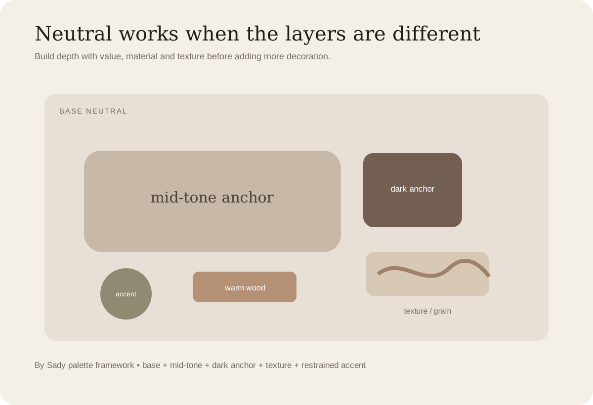
Rooms feel flat when every large surface has similar lightness. A pale wall, pale sofa, pale rug and pale curtains can merge together even when the individual pieces are attractive.
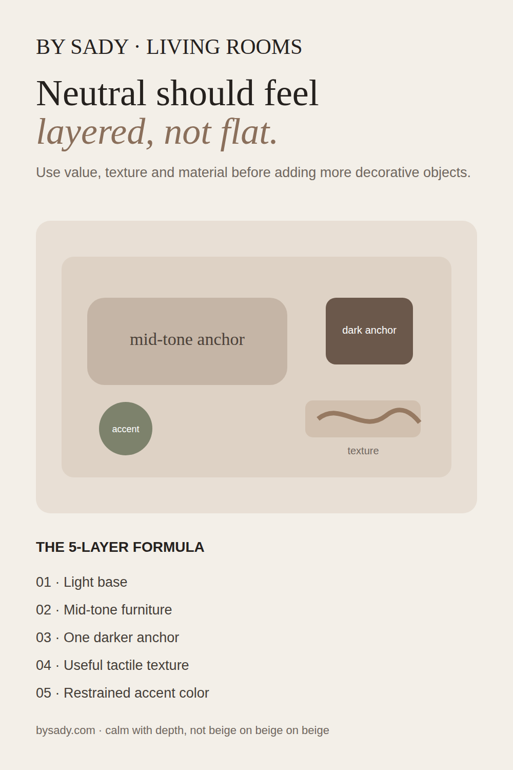
Use three value levels as a planning tool. The lightest layer is often walls, curtains or a large rug. The middle layer may be the sofa, wood furniture or textiles. The darkest layer can be a coffee table, frame, lamp, side chair, artwork or a few smaller details.
The darkest element does not need to be black. Walnut, chocolate brown, olive, charcoal and deep bronze can all provide enough visual weight.
| Layer | Typical role | Examples | What it does |
|---|---|---|---|
| Light | Background | Warm white wall, cream curtain, pale rug | Keeps the room open and gives other materials room to register |
| Mid-tone | Main furniture / material body | Taupe sofa, oak, camel linen, mushroom upholstery | Stops the room from feeling washed out |
| Dark anchor | Contrast | Walnut table, dark frame, bronze lamp, charcoal chair | Gives the eye a resting point and sharper definition |
| Accent | Small personality layer | Muted rust, olive, dusty rose, blue-gray, art color | Adds individuality without breaking the calm palette |
Use texture for depth, not as a checklist
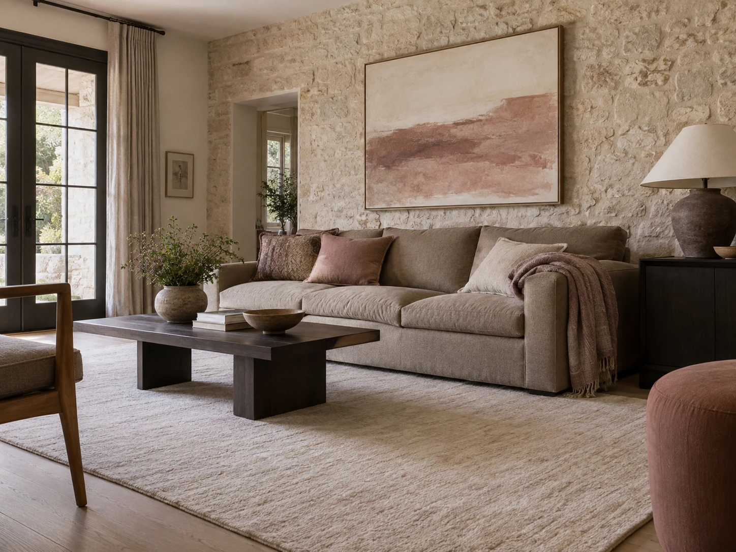
Current designer-led neutral rooms often rely on tactile materials such as linen, wool, boucle, wood, stone and woven fibers because a quiet color palette makes surface differences more visible.
The useful principle is contrast between textures, not hitting a required number. A smooth plaster wall, nubby sofa, soft wool rug and grainy wood table already create several distinct surfaces.
Avoid adding a basket, boucle chair and chunky throw simply because neutral-room formulas say you should. If an object has no function or visual role, texture alone does not justify it.
Let wood tone do some of the warming
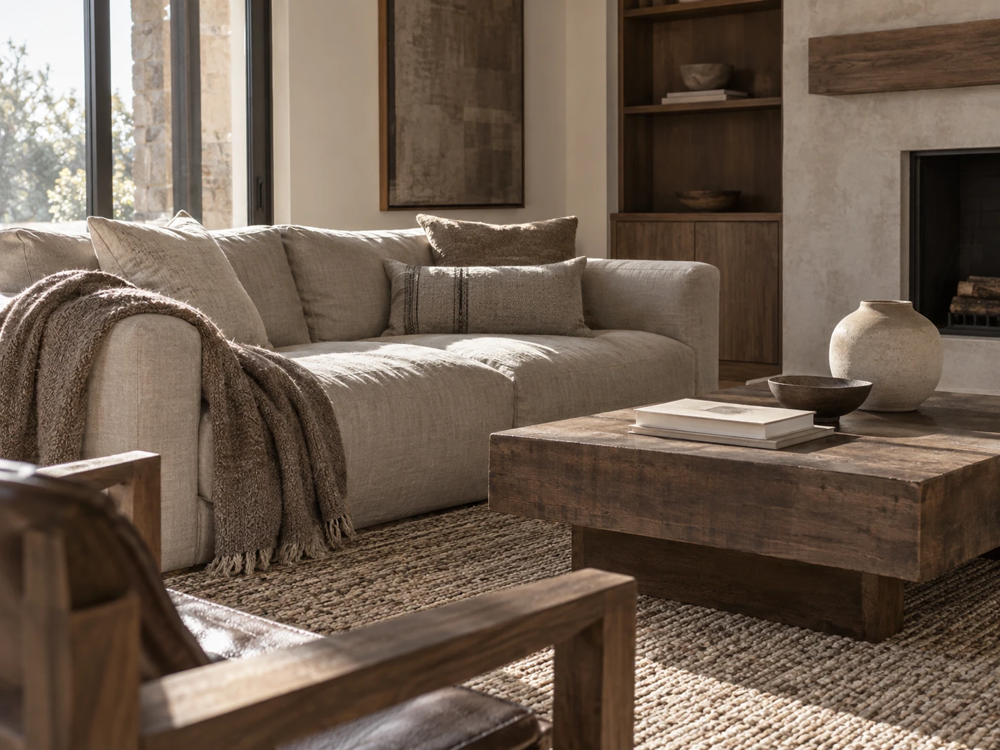
Wood is one of the easiest ways to stop cream and beige from feeling sterile. Oak, walnut, chestnut and other natural finishes introduce warmth plus grain, which behaves like a subtle pattern.
Do not assume every wood must match exactly. A room can mix woods when one family leads and the differences look deliberate. Repeating the dominant undertone in two or three places is usually enough to connect them.
If the sofa and rug are both pale, a richer wood coffee table or cabinet can also provide the darker anchor the composition needs.
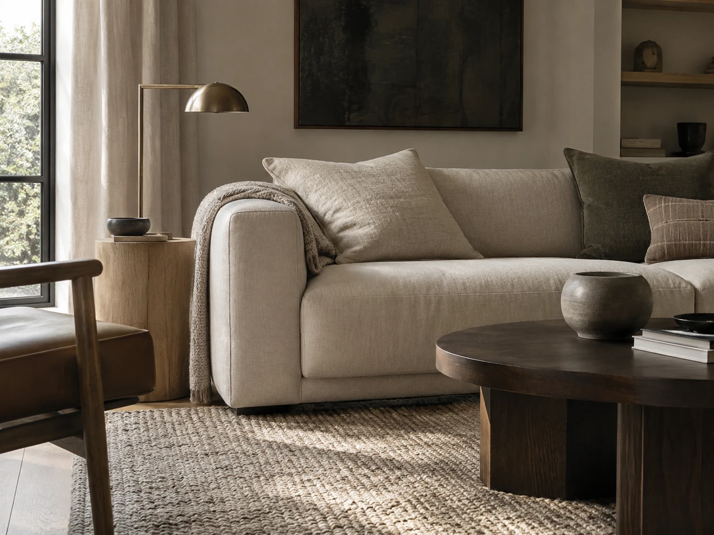
Mix light and dark woods by repeating each tone
You do not need to buy every wooden piece in one finish. A lighter oak and a darker walnut can create useful contrast when the difference is obvious enough to look deliberate.
Let one wood family lead, then repeat the secondary tone elsewhere through a side table, frame, shelf or smaller furniture piece. Repetition makes the contrast feel connected rather than accidental.
Pay attention to temperature as well as darkness. Woods that share a broadly compatible warm or balanced undertone are usually easier to combine than finishes that fight each other at the orange, pink or gray extremes.
| Starting room palette | Useful wood strategy | What to check in the room |
|---|---|---|
| Ivory upholstery and a pale rug | Add one visibly deeper wooden anchor, then echo it in a smaller piece | Compare undertones in daylight and evening lamplight |
| Warm white walls with pale oak floor | Repeat oak as the leading family; introduce darker wood sparingly | Avoid adding several unrelated orange, pink or gray stains |
| Taupe textiles with existing walnut furniture | Let walnut lead and use restrained lighter accents for relief | Repeat the secondary tone rather than buying a matched full set |
| Mixed inherited furniture | Connect pieces with a repeated textile or warm neutral backdrop | Preserve personality; not every piece needs the same finish |
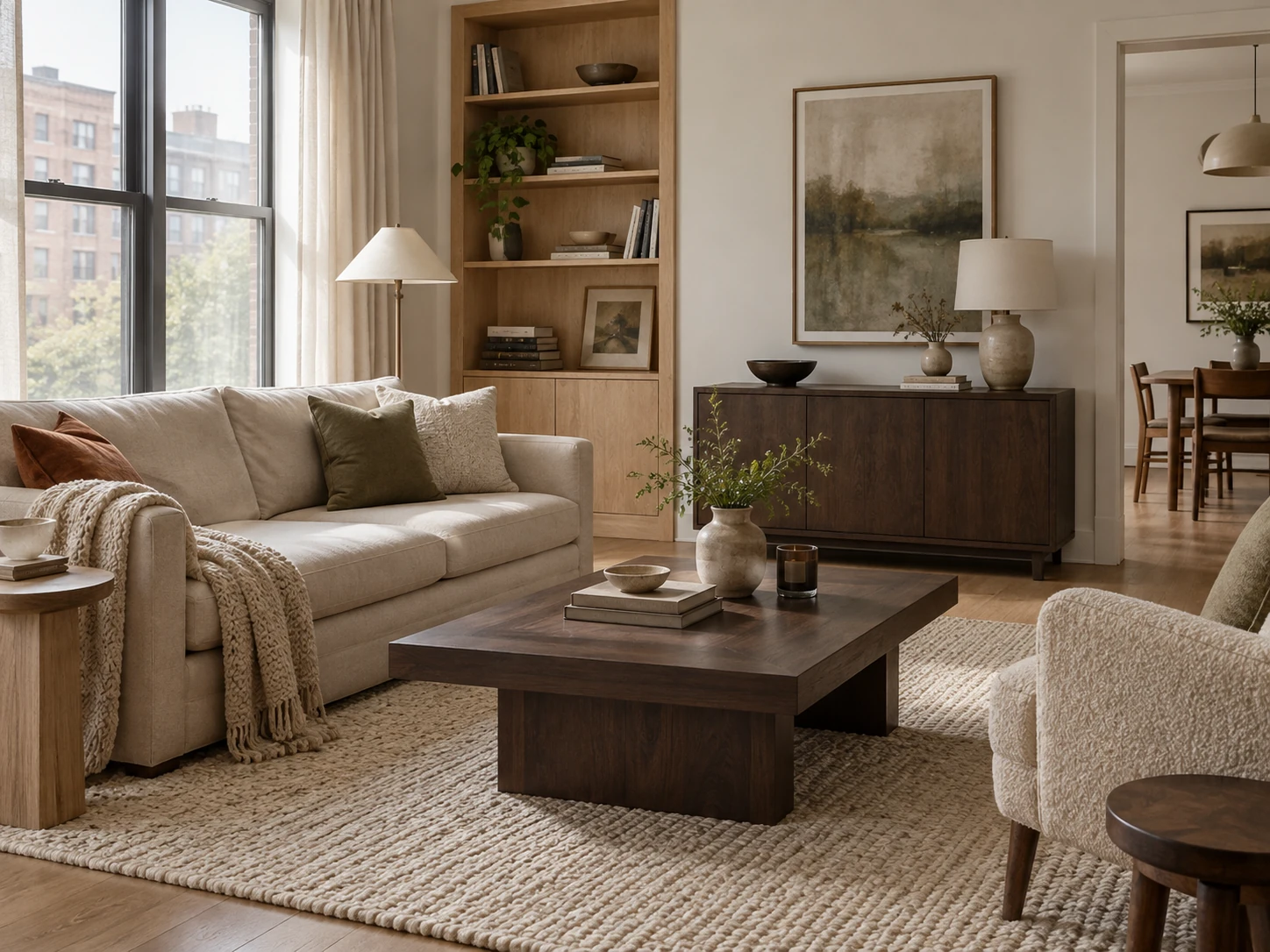
Choose metal finishes as punctuation, not another palette
Metal hardware and lighting are small but repeat across a room. Brass, bronze, blackened metal, chrome and nickel can each work in a neutral scheme.
Choose one dominant finish and let any second finish appear intentionally. Mixing every metal in equal amounts can make a compact room feel fragmented because the eye catches each high-contrast detail.
The finish should support the overall temperature of the room rather than being chosen from a trend list.
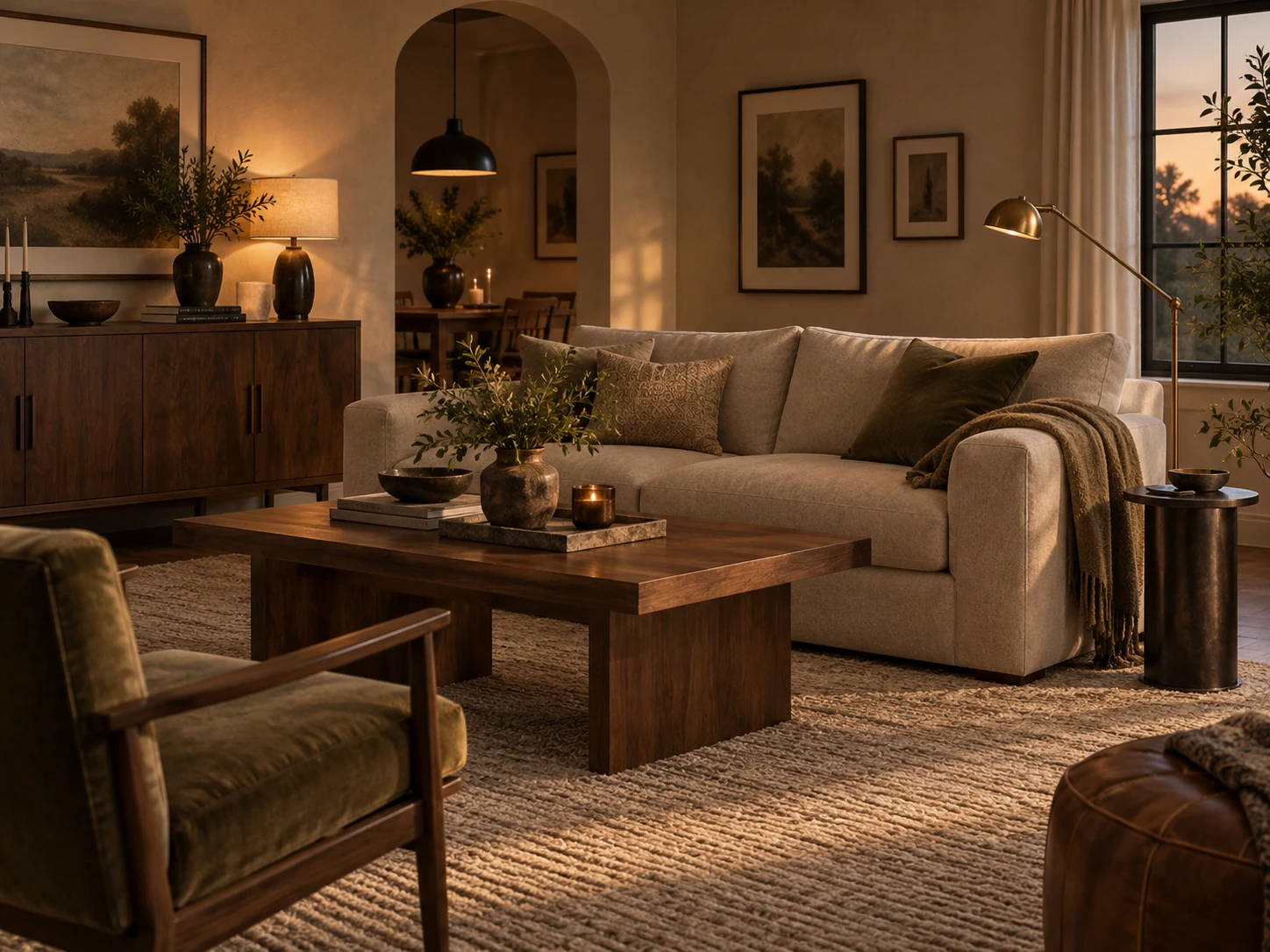
Lighting changes how every neutral reads after dark
A neutral palette can look beautifully warm in daylight and suddenly gray or yellow under poor artificial light. Treat evening lighting as part of the palette.
Layer general lighting with a lower table, floor or wall light rather than relying only on bright ceiling light. Current designer guidance continues to favor layered lighting because it adds depth and gives different parts of the room their own pools of light.
Before buying a paint color or large beige sofa, look at the sample in the room at the times you actually use the space.
Use the rug to introduce quiet pattern or material contrast
The rug is one of the largest visual surfaces in a living room, so it can keep a neutral scheme from becoming one uninterrupted block of color.
A tonal pattern, natural weave, subtle stripe or visible wool texture can add movement without introducing a new dominant color. If the sofa is highly textured, a calmer rug can create balance; if the upholstery is smooth, the rug can do more of the tactile work.
Choose the rug from the seating layout first. Styling cannot compensate for a rug that is too small for the furniture grouping.
Continue with this part of the plan Plan the room first: Small Living Room IdeasUse the layout guide to solve the sofa, route, table, dining or work zone before styling the palette.
Read the guide →Use art to stop the room becoming anonymous
Neutral rooms can become generic when all personality is removed in the name of calm. Art is a useful place to introduce color, history and subject matter without changing the entire palette.
Choose work you actually want to live with, then pull one or two subtle tones from it into cushions, a throw or another small object. The room stays controlled but gains a point of view.
A single larger work or a deliberate group often reads more clearly than filling every blank section of wall.
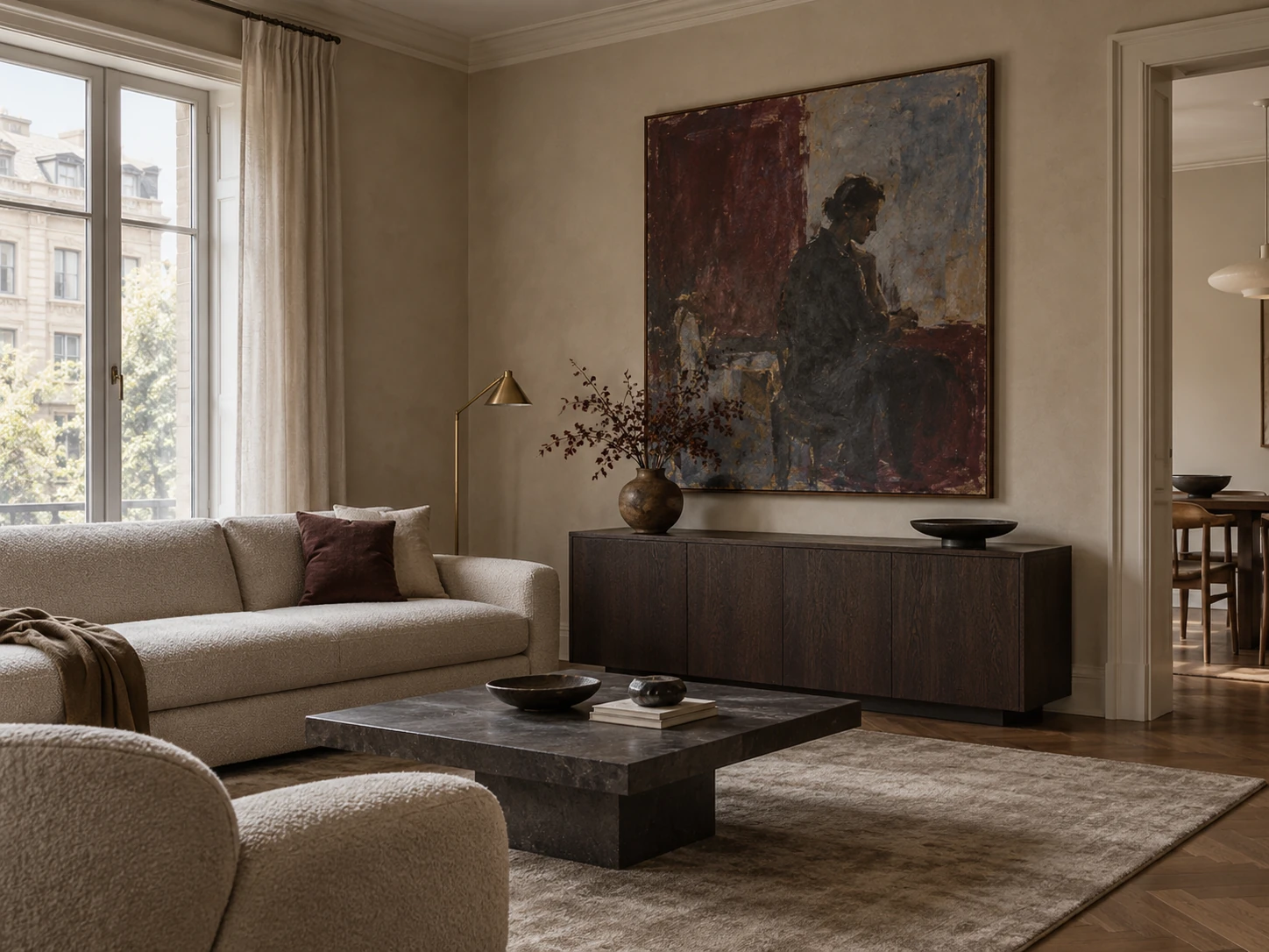
Add one accent family instead of many unrelated pops
If the room needs color, choose one family and repeat it lightly. Olive with warm beige, rust with cream, dusty rose with mushroom, or muted blue with stone can all work.
The accent does not need to occupy a fixed percentage of the room. Use it wherever the composition needs separation or personality, then stop before it becomes a second full palette.
Flowers and books can also provide temporary accent color without committing to another large upholstered piece.
Do not confuse neutral with minimal
A neutral room can be layered, traditional, rustic, contemporary or collected. It does not have to contain almost nothing.
What keeps it calm is hierarchy: a few large visual anchors, repeated materials, enough negative space and a limited color vocabulary. A room with books, art and vintage furniture can still feel neutral when those objects relate to one another.
Conversely, a nearly empty room can feel visually messy if every remaining object has a different undertone, scale and finish.
Use personal and vintage pieces to break the showroom effect
Current designer commentary increasingly pushes back against interiors that feel like matching sets. A vintage side table, inherited object, handmade ceramic or personal artwork can interrupt the perfection in a useful way.
The object does not need to match the dominant style exactly. It needs a visual bridge, such as a repeated wood tone, color, shape or material.
One characterful piece often adds more warmth than several generic accessories selected only because they are beige.
Run the neutral-room audit before buying another accessory
Stand at the room entrance and identify the largest light surface, the main mid-tone, the darkest anchor and the strongest texture. If one of those layers is missing, solve that before adding small decor.
Then photograph the room. Neutral interiors often reveal flat areas or overly busy material mixes more clearly in a photograph than they do when you are standing inside them.
The goal is calm with depth: enough repetition to feel coherent, enough contrast to keep the room legible, and enough personality that it still feels like a home.
- A base neutral family is defined.
- Light, mid and dark values are all present.
- Wood tones relate rather than match mechanically.
- Texture comes from useful surfaces, not filler objects.
- Lighting still flatters the palette after dark.
- The rug relates to the seating footprint.
- Art or personal objects provide character.
- Accent color is controlled rather than scattered.
- Some surfaces and wall areas remain quiet.
Keep the visual summary.
This is the condensed version of the guide, useful when you are planning, comparing options or returning to the key decisions later.
Where the measurable guidance comes from
By Sady's styling advice is editorial. Where this guide uses measurements or specific planning guidance, these are the references used. Always measure your own room and follow local electrical and building requirements.
- Better Homes & Gardens: Designer dos and don’ts for updating interiors
Current designer commentary on warmer tones, layered lighting, texture and moving away from overly matched interiors.
- Homes & Gardens: Warm minimalist living room analysis
Current reference for layering neutral tones with wood, linen, boucle and controlled accent color.
- House Beautiful: Small-space decorating rules designers ignore
Current designer perspectives supporting intentional color, mixed woods and personal rather than rigid small-space rules.
- Nordic Design Blog: Layered neutral living room guide
Secondary reference for undertones, value contrast and texture layering in neutral rooms.
Explore focused guides for this topic.
Home Furnishings & Furniture Statistics 2026: Prices, Renovation and Decorating Activity
A citable 2026 reference separating U.S. furniture and household-furnishing price changes from Houzz renovation and decorating participation, with methodology notes and reusable charts.
How to Mix Textures in a Neutral Living Room Without Making It Busy
A repeatable texture framework for neutral living rooms using surface, scale, sheen and material contrast instead of piling several similar beige textiles into one room.
Cream Living Room Ideas That Still Have Depth and Definition
A practical cream living-room guide using value contrast, wood, texture, art and lighting so pale upholstery and walls do not dissolve into one flat field.
More from Living Rooms.
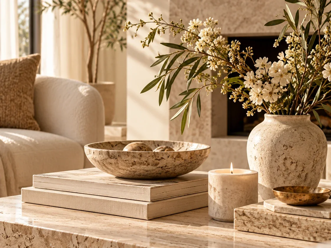
Coffee Table Styling Ideas: A Practical Formula That Still Leaves Room to Live
A practical coffee-table styling guide built around table shape, daily use, object scale, trays, books, organic elements and leaving enough empty surface for real life.
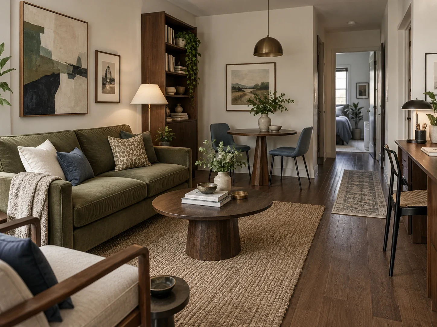
Small Living Room Ideas: A Practical Guide to Layout, Seating, Storage and Flow
A measurement-first guide to small living rooms, covering sofa size, walking routes, coffee tables, rugs, TV placement, storage and rooms that also need dining or work space.
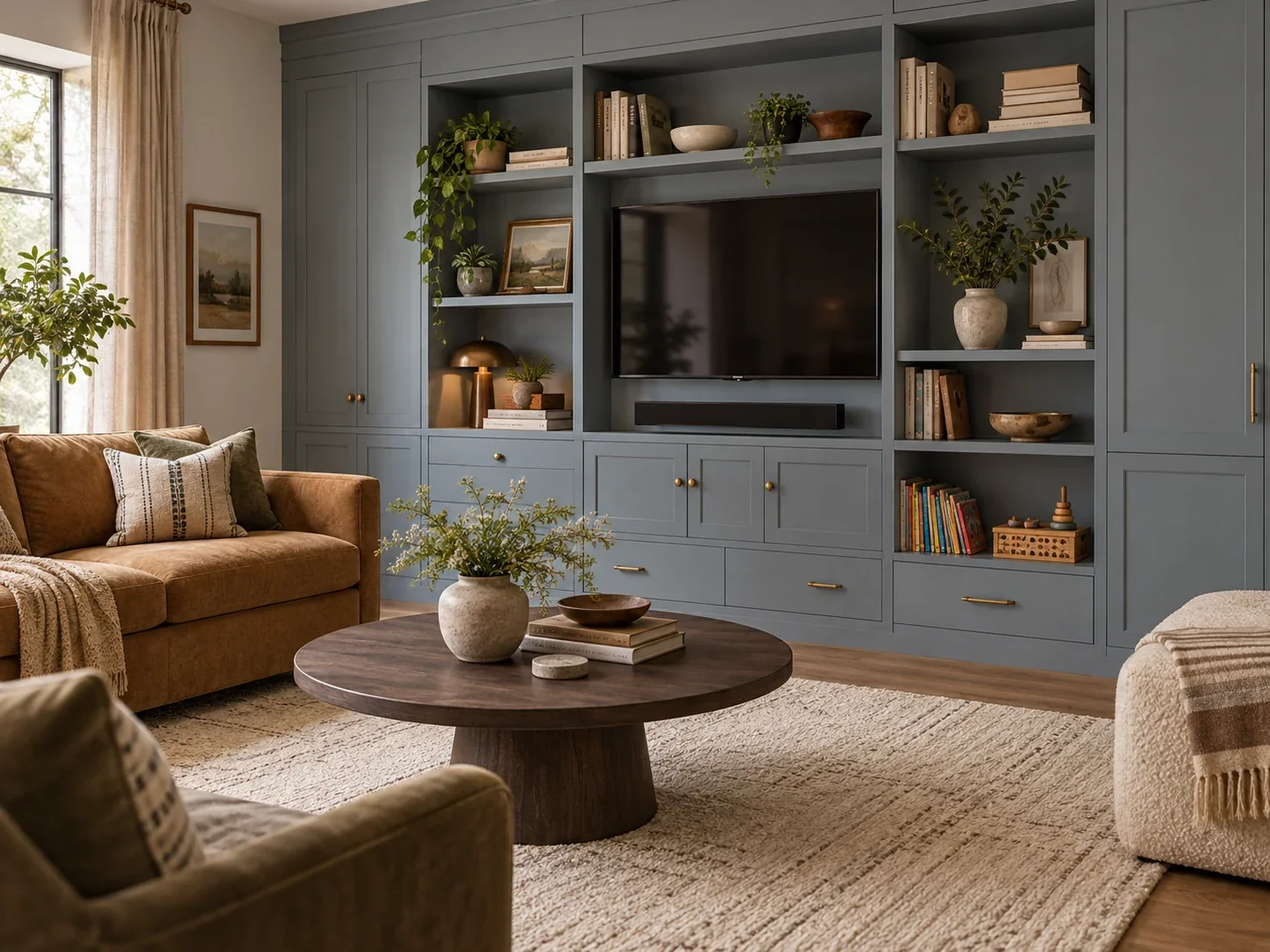
Small Living Room Storage Ideas: What to Hide, Display and Put on the Wall
A practical storage guide for compact living rooms, covering open versus closed storage, media units, toys, books, multifunctional furniture, wall height, renters and furniture safety.