
How to Mix Textures in a Neutral Living Room Without Making It Busy
A repeatable texture framework for neutral living rooms using surface, scale, sheen and material contrast instead of piling several similar beige textiles into one room.
Texture adds depth only when the materials have different jobs. Five fuzzy beige things are still one visual note.
Part of the By Sady guide Neutral Living Room Ideas →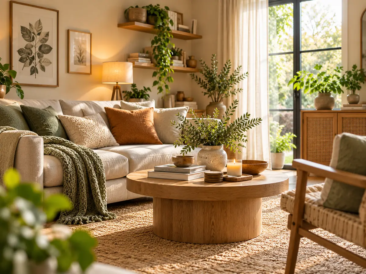
What matters most
- 01
Mix different surface types, not merely several soft fabrics.
- 02
Vary scale so large woven surfaces and small detailed textures do not compete.
- 03
Balance matte and reflective finishes.
- 04
Repeat a small material vocabulary to keep the room coherent.
- 05
Use seasonal swaps for soft layers rather than rebuilding the whole room.
Think in texture families
List the major surfaces already in the room: upholstery, rug, wood, metal, glass, stone, curtains and cushions. The goal is to make those surfaces contribute different kinds of tactile and visual information.
A linen sofa plus linen curtains plus linen cushions is repetition, not necessarily texture contrast.
| Texture dimension | Contrast example | Effect |
|---|---|---|
| Soft / hard | Bouclé chair + wood table | Creates tactile contrast |
| Smooth / rough | Polished stone + woven rug | Separates surface character |
| Matte / reflective | Matte ceramic + aged metal | Adds controlled light variation |
| Large / fine scale | Broad weave + small detailed textile | Prevents every texture from reading at one scale |
Let the largest surfaces stay calmer
Large rugs, sofas and curtains cover enough area that very strong texture can dominate a compact room. Use one or two larger textured surfaces, then let smaller objects carry finer detail.
This keeps the room layered without becoming noisy.
Use wood as a structural texture
Wood contributes grain, warmth and value variation even when the palette remains neutral. Repeating one or two related wood tones can ground pale upholstery.
Avoid introducing many unrelated wood finishes purely for variety.
Use metal and glass as contrast, not volume
A lamp stem, table base or frame can add a harder, more reflective note without taking over the room.
Small doses often work better than several shiny objects spread across every surface.
Repeat materials deliberately
If a woven texture appears in the rug, repeating a related weave in one basket can make the room feel connected. Repetition creates rhythm.
The repeated material does not need to be identical. It needs to feel related enough that the contrast elsewhere looks intentional.
Build a texture hierarchy instead of collecting samples
Choose one large texture, one supporting texture and one or two smaller accents. For example, a woven rug can be the large layer, linen upholstery the supporting layer and a ceramic lamp plus one plush throw the accent level.
This hierarchy matters in small rooms because every surface is seen at once. When the rug, sofa, curtains, cushions and accessories all have equally strong texture, the room can feel visually crowded even when the color palette is quiet.
| Layer | Typical scale | Useful examples |
|---|---|---|
| Primary texture | Large | Rug, sofa upholstery, curtains |
| Supporting texture | Medium | Wood table, woven chair, large cushion |
| Accent texture | Small | Ceramic, metal, throw, basket |
Use cushions as testing tools
Cushions and throws are low-commitment ways to test texture combinations before replacing a rug or chair.
Use them to introduce one missing texture family rather than buying several decorative objects at once.
Keep color restrained while texture changes
When the room already has several material contrasts, a controlled color palette helps the eye read the differences without feeling overloaded.
Warm whites, creams, taupes, browns and muted accents can carry substantial texture variation.
Texture checklist
A neutral room should have enough surface difference to create depth but enough repetition to remain coherent.
Remove one layer if every surface is demanding attention.
- At least one hard and one soft material are visible.
- Smooth and rough surfaces are balanced.
- Matte and reflective finishes are controlled.
- Large textures do not all compete.
- One or two materials repeat across the room.
- Seasonal softness can change without replacing the core furniture.
Use the main neutral-living-room guide for color, furniture and room-wide layering decisions.
Read the guide →Keep the visual summary.
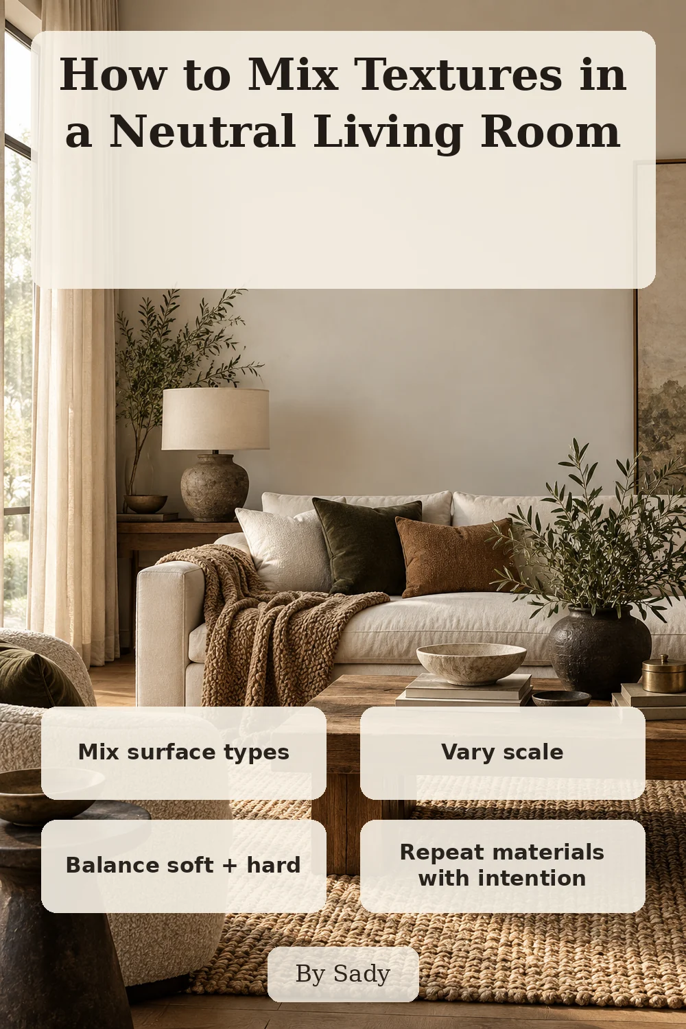
This is the condensed version of the guide, useful when you are planning, comparing options or returning to the key decisions later.
More from Warm Neutral Living Rooms.
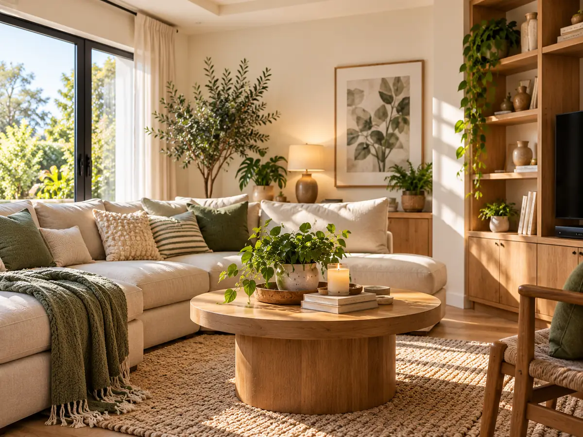
Cream Living Room Ideas That Still Have Depth and Definition
A practical cream living-room guide using value contrast, wood, texture, art and lighting so pale upholstery and walls do not dissolve into one flat field.
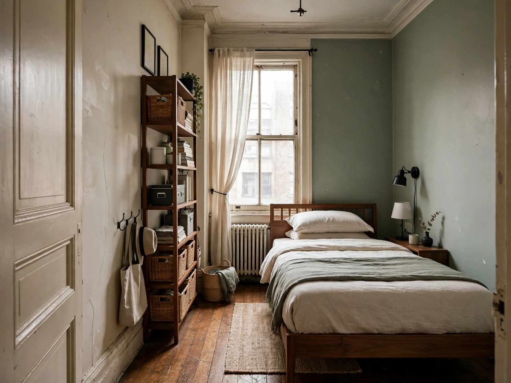
Small Bedroom Ideas: A Complete Guide to Layout, Storage, Lighting & Style
A practical small-bedroom design guide built around floor planning, circulation, storage, lighting and the details that make a compact room feel calm instead of crowded.
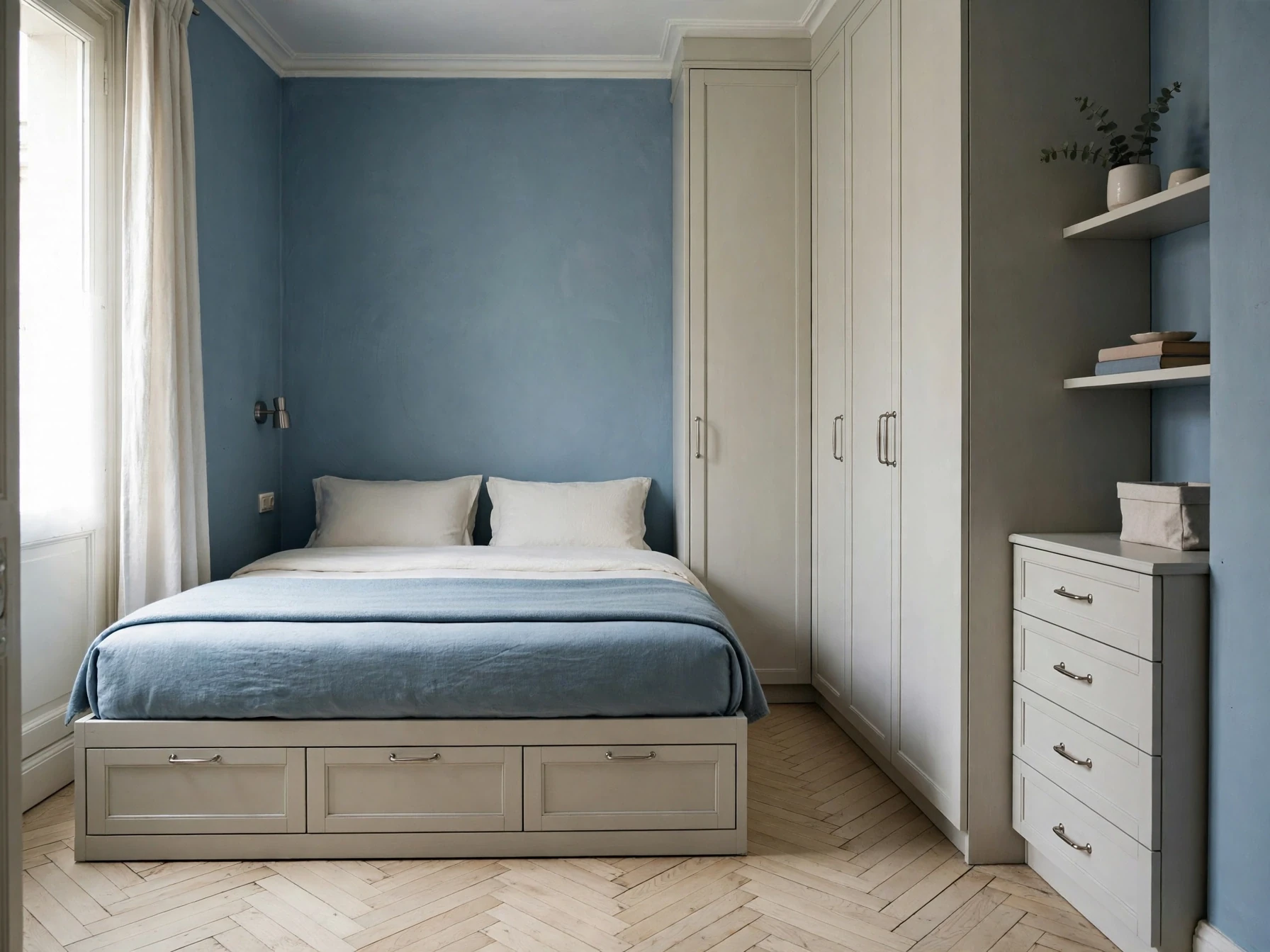
Small Bedroom Storage Ideas: A Practical System for Finding More Space
A storage-first guide for small bedrooms, with a simple system for deciding what belongs under the bed, beside it, on the walls, inside the wardrobe and out of sight.