
How to Make a Small Bedroom Look Expensive
A room-by-room editing guide to making a small bedroom feel more considered through proportion, lighting, bedding, curtains, materials and visual restraint, not just more expensive purchases.
An expensive-looking bedroom is rarely about filling it with expensive objects. It is usually the result of proportion, repetition, good light and knowing what to leave out.
Part of the By Sady guide Small Bedroom Ideas: Complete Guide →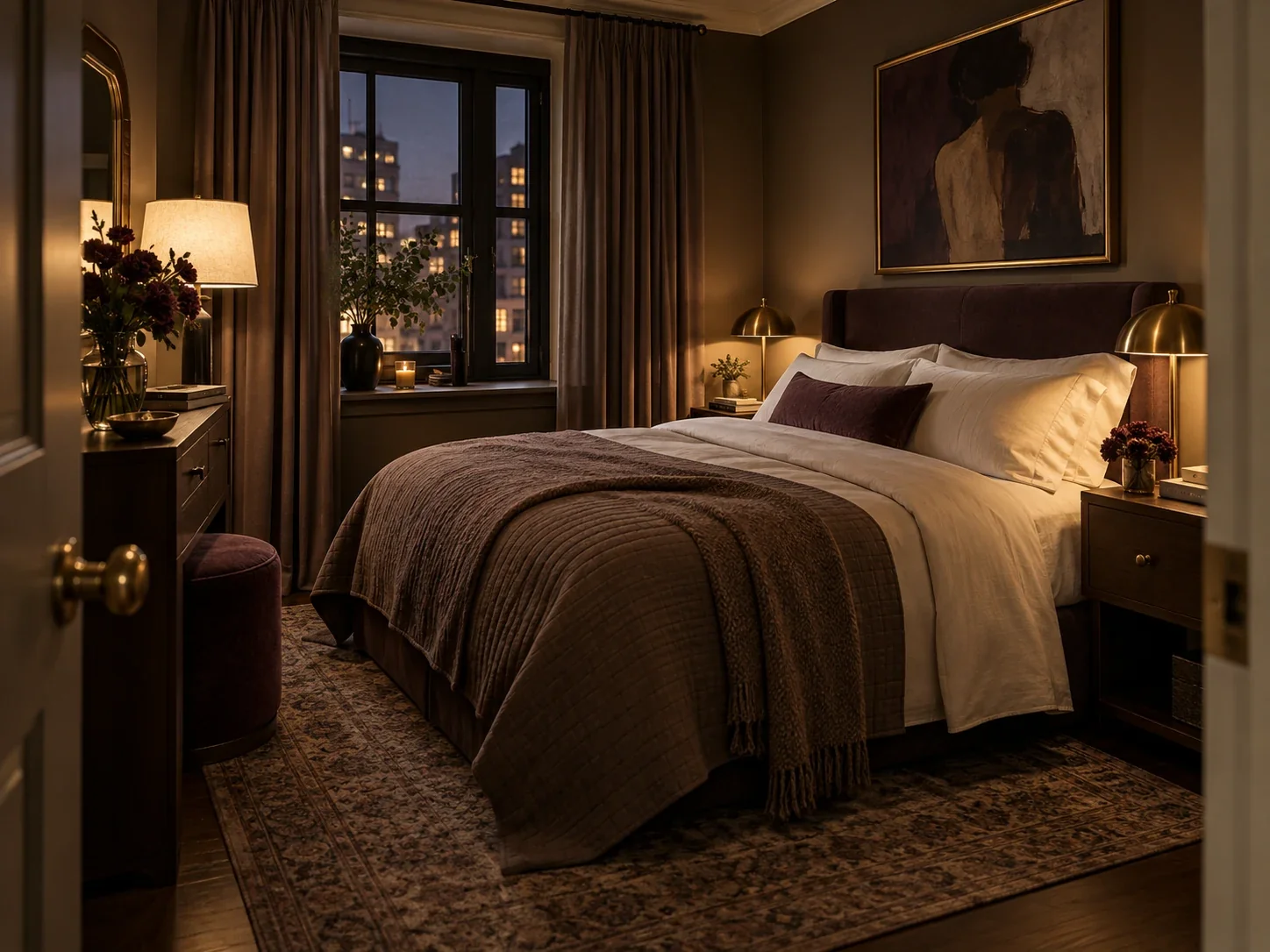
What matters most
- 01
Fix proportion before buying decor. Furniture that is too deep, too small or crowded together makes even expensive pieces look accidental.
- 02
Make the bed the visual anchor, then let the rest of the room support it instead of competing with it.
- 03
Repeat a small set of colors, materials and finishes so unrelated pieces read as one composition.
- 04
Layer lighting at different heights and keep the evening light warm enough to flatter the room.
- 05
Spend visual attention on scale: curtains, art, rugs, lamps and headboards often look more convincing when they relate properly to the bed and wall.
- 06
Leave some surfaces and wall area quiet. Luxury often reads as editing, not abundance.
First define what “expensive-looking” actually means
An expensive-looking bedroom is not necessarily a bedroom full of expensive objects. What usually reads as polished is coherence: the bed has the right visual weight, furniture fits the available space, materials repeat, lighting is flattering, window treatments look intentional and there are fewer weak little decisions competing for attention.
That distinction matters even more in a small bedroom. There is less distance between objects, so awkward scale, mismatched finishes and clutter become more obvious. Buying another decorative object rarely fixes those problems. Editing the composition often does.
Use this guide as a visual hierarchy, not a shopping list. Start with the decisions that affect the whole room and leave small accessories until the end.
Start with proportion, because poor scale makes good furniture look cheap
Before changing bedding or adding art, look at the room as a set of proportions. Is the nightstand tiny beside a substantial bed? Is a deep dresser constricting the only walkway? Is the rug floating like a bath mat? Is the lamp too small for the headboard and wall behind it?
Interior designers regularly use scale and proportion to create rooms that feel resolved. In a compact bedroom, the principle is practical as well as visual: furniture should feel substantial enough to belong, but not so deep or numerous that the room becomes leftover space around it.
If the room feels “off,” remove one secondary piece and reassess before replacing anything. A room with one properly scaled nightstand can look more deliberate than a room with two miniature tables squeezed into unusable gaps.
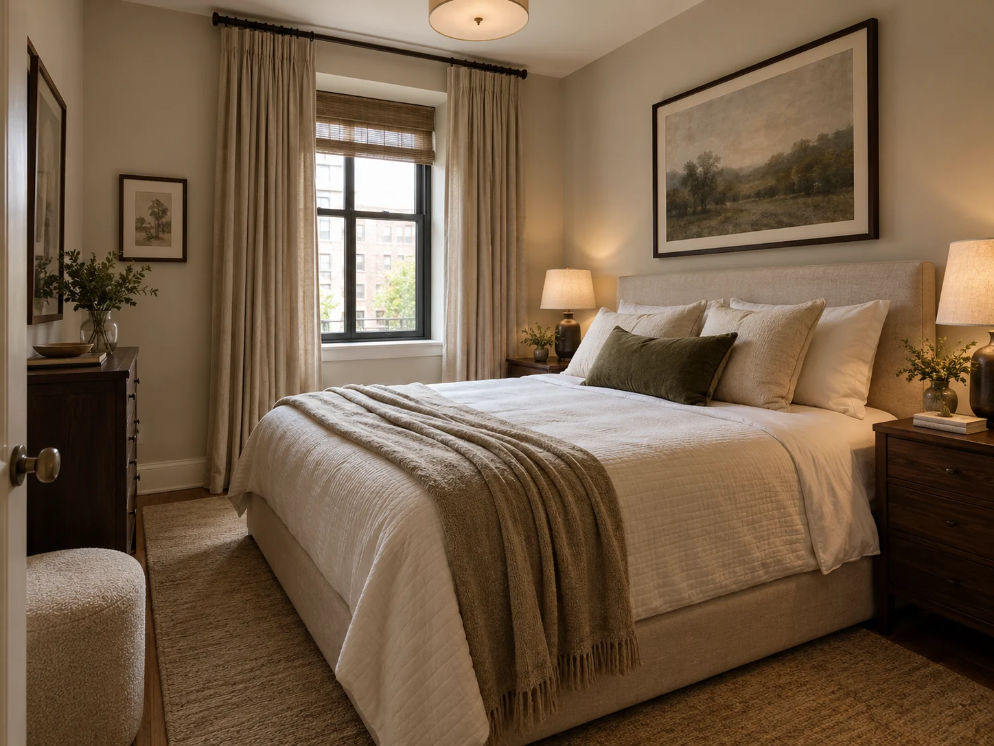
Use the room measurements, bed footprint, wardrobe opening zones and circulation before styling.
Read the guide →Make the bed the visual anchor instead of decorating every wall
The bed normally occupies the most area and attention in a small bedroom, so it should carry more of the visual work. That does not require a dramatic designer frame. A clean bed shape, a headboard with enough presence, orderly bedding and one or two intentional layers can create a stronger focal point than several unrelated decorative moments around the room.
Think in large blocks first: headboard, bedding, curtains, rug and the wall behind the bed. These surfaces control far more of the room than trays, candles or small ornaments.
If the bed is visually strong, secondary furniture can become quieter. That is useful in a small room because it reduces the feeling that every corner is asking for attention.
Layer the bed, but do not bury a small room in pillows
Designer advice about luxurious beds often emphasizes layers and texture. The useful part is depth, not sheer quantity. Start with smooth bedding, add one contrasting blanket or coverlet and introduce a smaller number of pillows in different scales or textures.
A bed stacked with decorative pillows can look rich in a large hotel suite but become impractical in a small bedroom when the pillows have nowhere to go at night. Choose a setup you can actually reset in a minute or two.
Fabric quality is also visible through drape and texture, not just fiber labels. Washed linen, crisp cotton, a dense woven throw or a restrained velvet accent can create contrast without requiring five competing materials.
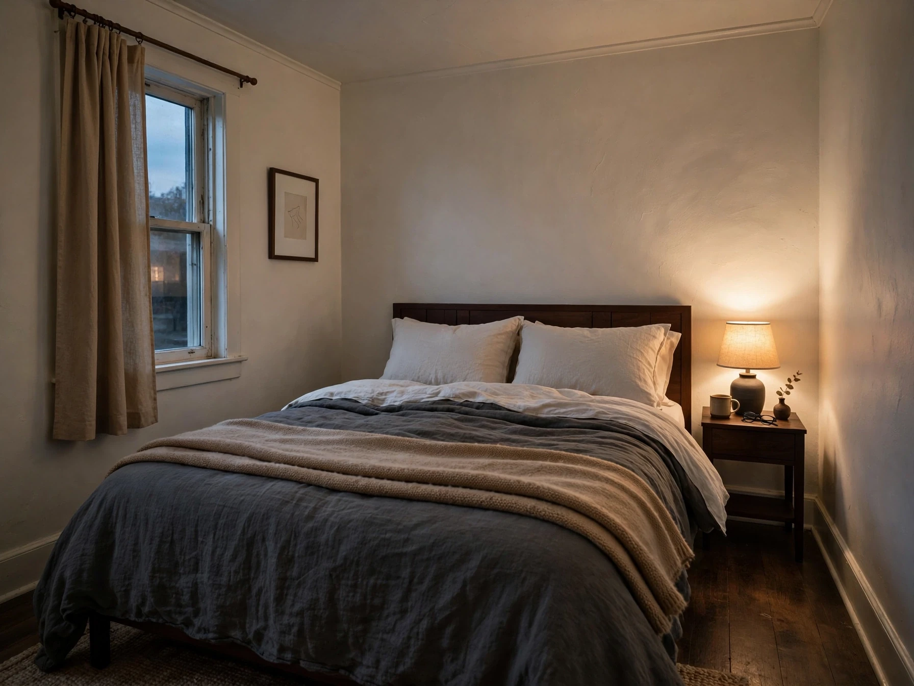
Use the budget guide for spend order and zero-cost changes; this page is about visual composition.
Read the guide →Repeat materials so the room feels collected rather than assembled
A room often starts to look expensive when unrelated purchases appear to belong together. Repetition is one of the simplest ways to create that connection. If the bedside lamp has warm brass, repeat that finish once or twice in a frame, handle or wall light. If the room uses dark walnut, let another small piece echo the same warmth.
The repetition does not need to be exact. The goal is to reduce the number of unrelated visual languages. Three different metals, several wood undertones and multiple whites can make a compact room feel pieced together even when every item is attractive on its own.
Choose a small material vocabulary and let texture provide variation within it.
| If the room currently has... | Why it can feel less considered | A stronger editing move |
|---|---|---|
| Many unrelated metal finishes | Small hardware details compete at close range | Choose one dominant finish and repeat it selectively |
| Several wood tones with no relationship | Warm and cool undertones can make furniture feel accidental | Keep one main wood family and use contrast deliberately |
| Lots of tiny decor | Attention gets fragmented across the room | Group useful objects and keep some surfaces empty |
| Furniture all the same height | The room can feel flat and showroom-like | Vary height with a lamp, art or vertical element |
| One texture everywhere | A neutral palette can read flat rather than calm | Layer linen, wood, wool, glass or ceramic within the same palette |
Use lighting to create depth after dark
A single bright ceiling fixture flattens the room because everything is illuminated from one height. A more polished evening atmosphere usually comes from layers: general light plus a lower bedside or task source and, where useful, a soft accent source.
Wall-mounted bedside lighting can be especially effective in a small room because it frees the nightstand while adding a designed architectural element. A small dresser lamp can create the second low pool of light that makes the room feel less flat.
Keep the color of the evening light reasonably consistent. A very cool ceiling lamp beside very warm bedside lamps can make finishes and wall colors look disconnected. Dimming is useful because a room that needs strong light for cleaning or dressing does not need the same intensity before sleep.
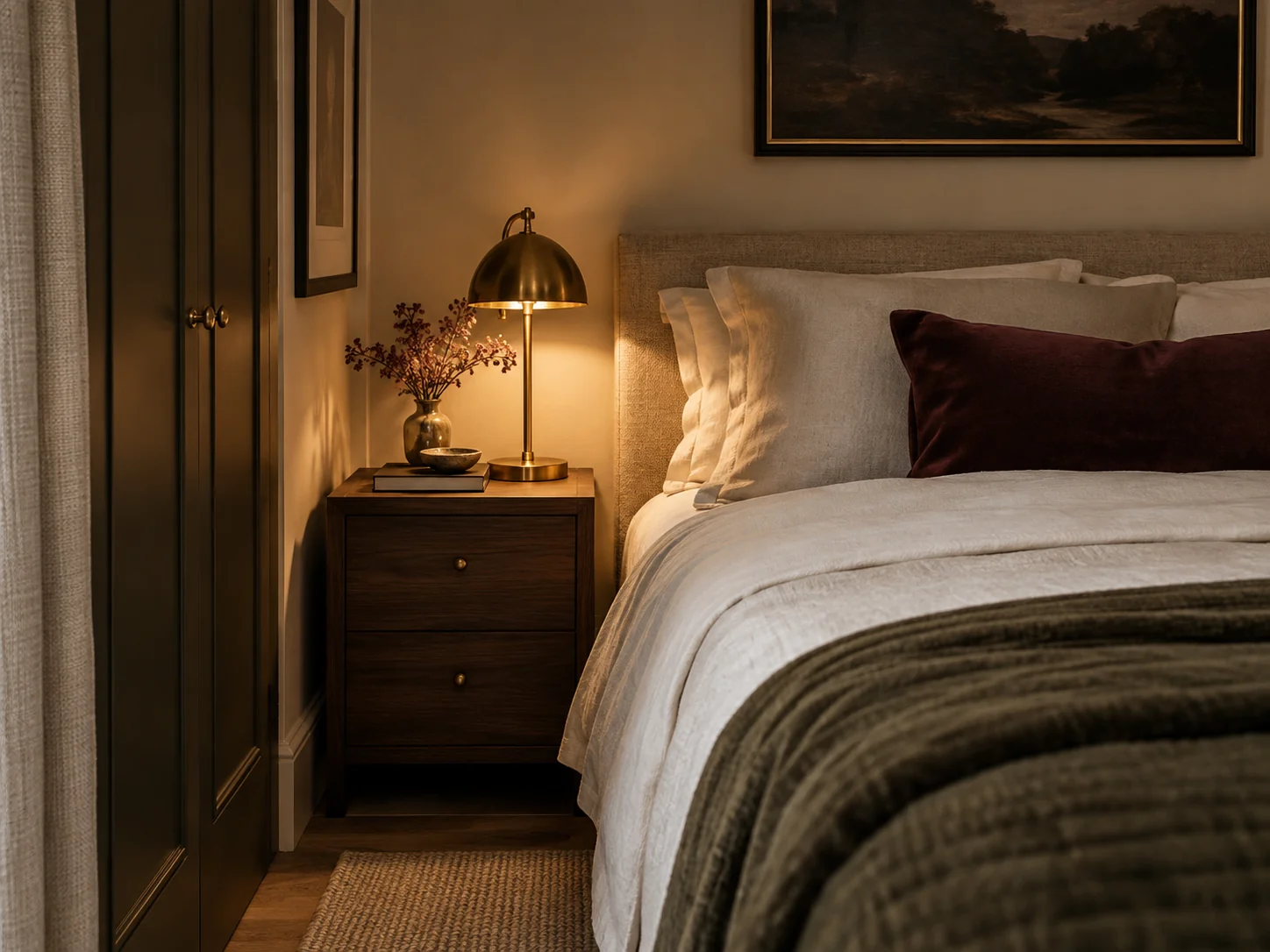
Go deeper on ambient, task, bedside and wardrobe light without sacrificing useful surfaces.
Read the guide →Make curtains relate to the wall, not only the window opening
Window treatments often look more expensive when they are treated as part of the room architecture rather than fitted tightly to the glass. Where the wall and hardware allow it, hanging the rod higher and wider can give fabric more presence and allow curtains to stack away from more of the window.
This is not a rule that every room needs floor-to-ceiling drapery. A Roman or roller blind can be much cleaner in a tiny space. The expensive-looking part is intentional fit: correct width, clean length, enough fullness and hardware that does not look undersized for the fabric.
If curtains puddle awkwardly, stop several inches above the floor, or block daylight because the rod is too narrow, adjust the fit before buying decorative trim.
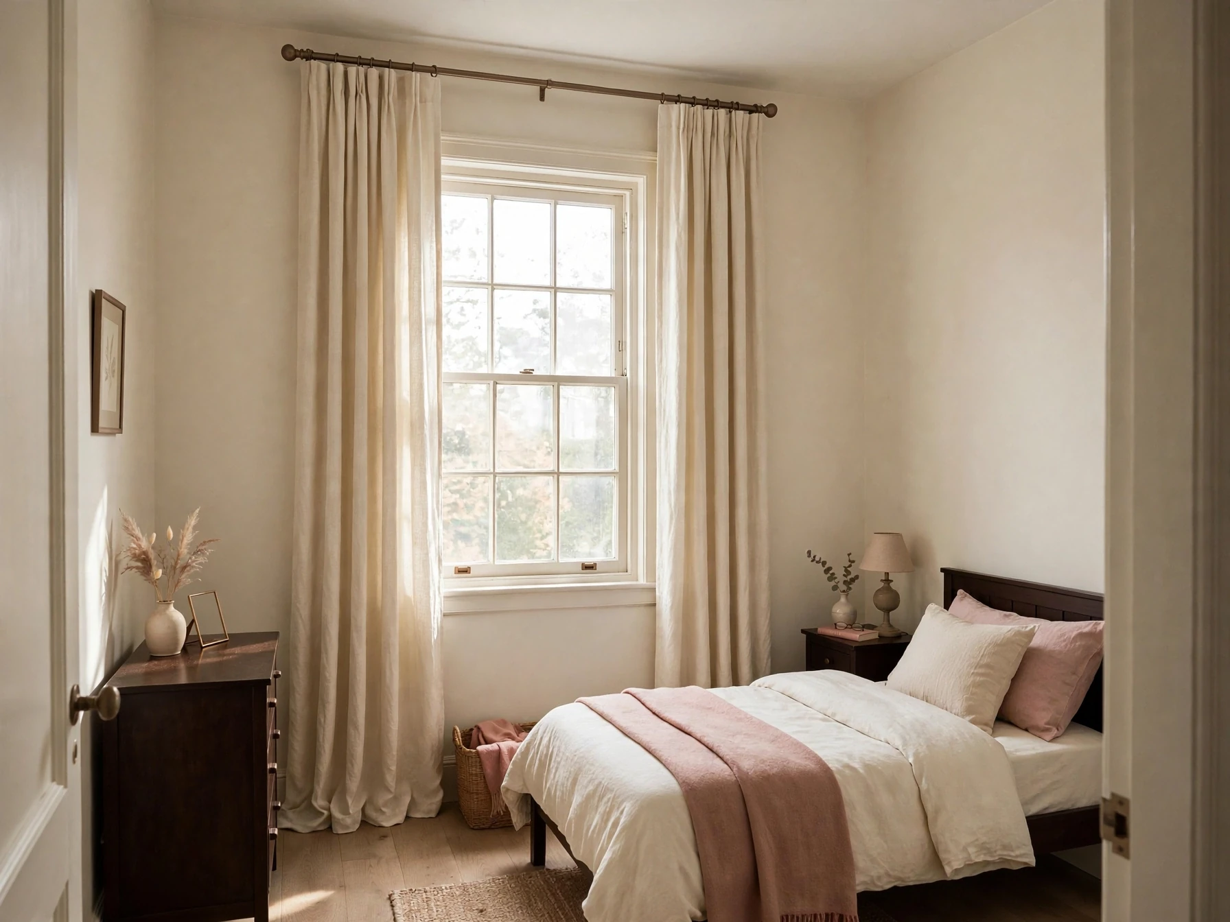
Choose one substantial piece of art instead of filling every blank patch
Small bedrooms accumulate tiny frames because each one is easy to buy. The result can feel visually busy. One larger piece, or one clearly organized pair or group, often gives the wall more confidence.
The art does not need to be expensive. Scale, placement and framing usually influence the finished effect more than whether the work came from a gallery. Use the bed, dresser or wall width as the reference so the art relates to something rather than floating independently.
Leave some blank wall. Negative space lets the focal pieces register and prevents the room from reading like every surface had to be “finished.”
Use hardware as a quiet consistency layer
Handles, knobs, switch plates and curtain hardware are small, but they repeat across the room. That makes them useful for visual consistency. Replacing or refinishing a few mismatched handles can sometimes make inexpensive storage feel more coherent with the rest of the scheme.
Do not turn hardware into a fake-luxury exercise. Highly ornate handles on a very plain cabinet can look more mismatched than the originals. The best upgrade usually belongs to the material language already in the room.
If you rent, keep original hardware labeled and stored so it can be restored later.
Let the rug connect the bed to the room
A rug that is too small can make the bed look visually detached from the floor. When the room and budget allow, use a rug large enough to relate clearly to the bed, with enough visible area at the sides or foot to feel intentional.
In very tight rooms, runners beside the exposed side of the bed can work better than forcing a large rug against wardrobes or doors. The rule is relationship, not a single prescribed size.
Check door clearance and pile height before buying. An attractive rug that catches every time the bedroom door opens will never feel luxurious in use.
Edit visible storage more aggressively than hidden storage
Luxury retail and hotel rooms usually show fewer everyday objects because the practical categories are contained. In a real bedroom, that does not mean owning almost nothing. It means deciding what deserves to stay visible.
Put chargers, medicine, spare toiletries, paperwork and backup products inside drawers, boxes or cabinets where possible. Leave open surfaces for the objects that are either used constantly or contribute something visually.
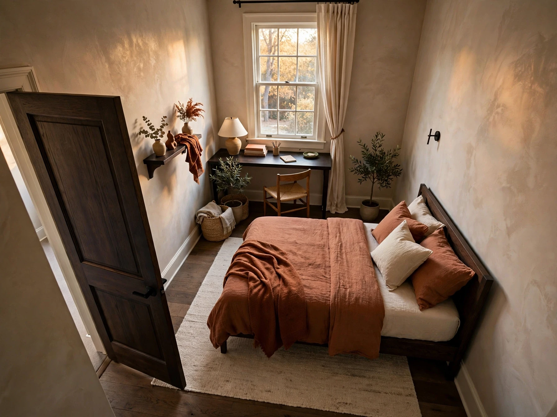
The simplest test is to photograph the room from the doorway. Small miscellaneous items often become more obvious in a photograph than they feel in daily life. Remove or group the things that break the main lines of the room.
Continue with this part of the plan Need more capacity first?Use the storage guide to solve under-bed, bedside, vertical, wardrobe and awkward-space storage before styling the visible surfaces.
Read the guide →Do not confuse beige with luxury
A neutral palette can look polished because it reduces visual noise, but neutral is not the only route to an expensive-looking room. Interior designers create sophisticated bedrooms with deep blues, earthy greens, plaster pinks, jewel tones and patterned fabrics as well.
The common factor is control. Choose a small palette and repeat it across the room rather than introducing a new accent color with every purchase. Dark rooms can feel cocooning; lighter rooms can feel airy. Either can look intentional when the colors relate to one another.
If you love color, spend your restraint on the number of colors, not on removing color completely.
Know what not to upgrade
Some changes have low visual return. Replacing a perfectly functional bed frame with another generic frame may change less than fixing curtains, lighting and bedding. Buying decorative storage boxes before solving where things belong usually creates more objects, not more order.
Do not replace furniture simply because it is inexpensive. A basic chest with the right scale and a consistent finish can sit comfortably in a refined room. Expensive furniture with the wrong depth or style can look worse.
Upgrade a piece when it solves a real visual or functional problem: the headboard is too small for the bed, the dresser blocks circulation, the lamp is underscaled, the curtains are badly fitted or the storage no longer supports the room.
Use a hierarchy when you decide what to change first
Stand at the bedroom door and identify the first three things you notice. Ideally, the bed or one architectural feature leads, then one supporting element, then the rest of the room settles back. If your eye jumps immediately to a cluttered rack, tiny rug and three unrelated lamps, the hierarchy needs editing.
Work from largest visual area to smallest detail. Fix layout and furniture scale first, then bed and windows, then lighting, then rug and art, then hardware and accessories. This order prevents small purchases from becoming a substitute for solving the big composition.
| Priority | Change first when... | Typical high-impact move |
|---|---|---|
| 1. Layout & scale | The room feels crowded or furniture blocks movement | Remove, reposition or replace the piece causing the spatial conflict |
| 2. Bed | The room has no clear focal point | Strengthen headboard, bedding layers and bed-wall composition |
| 3. Windows | Fabric looks undersized or blocks daylight | Correct rod position, fullness, length or choose a cleaner blind |
| 4. Lighting | The room feels flat or harsh after dark | Add a lower light layer and improve bedside/task lighting |
| 5. Rug & art | Elements look small and disconnected | Choose scale that relates to the bed or wall |
| 6. Hardware & accessories | The big composition already works | Repeat finishes and remove weak decorative filler |
The expensive-looking bedroom audit
Before you shop, walk through the room once with this checklist. The aim is not perfection. It is removing the signals that make the room feel accidental and strengthening the decisions that make it feel deliberate.
If the first five items are not working, do not spend much time on decorative accessories yet.
- The bed is positioned and scaled intentionally for the room.
- At least one comfortable circulation route is protected.
- The bed wall has a clear focal point rather than several competing ones.
- Bedding has depth and texture without becoming inconvenient to maintain.
- Curtains or blinds fit the window and wall cleanly.
- Evening lighting comes from more than one height.
- The rug relates clearly to the bed or is deliberately omitted.
- Wood, metal and textile finishes repeat enough to feel connected.
- Every visible surface has some breathing room.
- Art is scaled to the furniture or wall around it.
- Storage hides practical clutter rather than displaying every category.
- The room contains one or two memorable details, not ten minor statements.
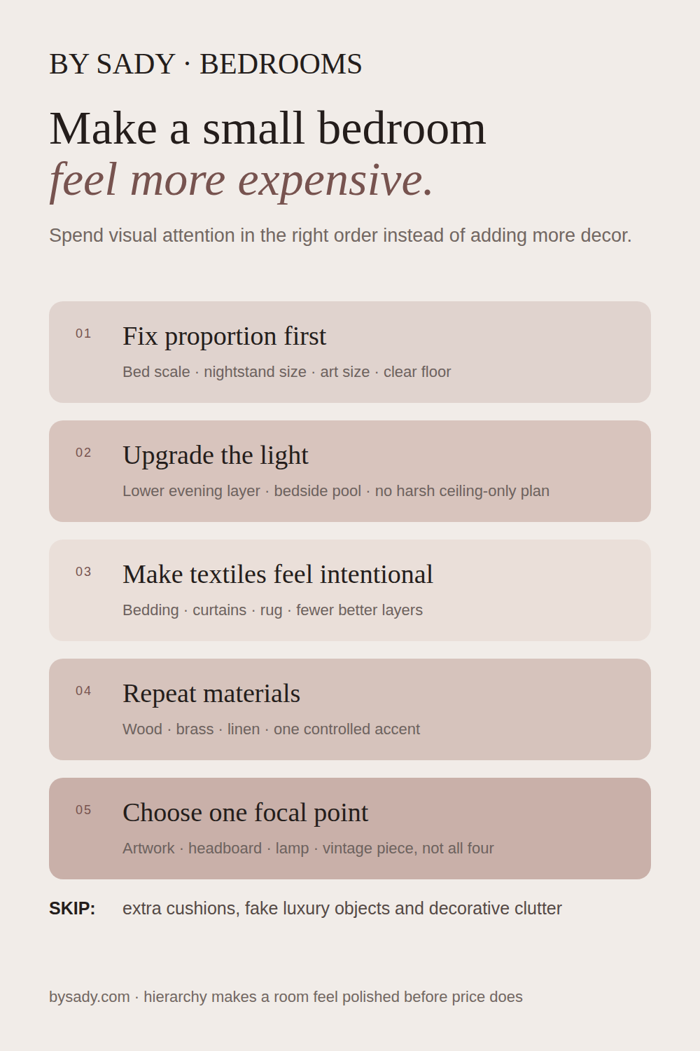
Keep the visual summary.
This is the condensed version of the guide, useful when you are planning, comparing options or returning to the key decisions later.
Where the measurable guidance comes from
By Sady's styling advice is editorial. Where this guide uses measurements or specific planning guidance, these are the references used. Always measure your own room and follow local electrical and building requirements.
- Homes & Gardens: How can I make my bedroom look expensive?
Designer commentary on layering, art, headboards, pattern, ceilings and lighting as routes to a more considered bedroom.
- Homes & Gardens: What colors make a small bedroom look more expensive?
Designer perspectives supporting the principle that many palettes can look high-end when they are balanced and used consistently.
- Homes & Gardens: How to make a bed look more expensive
Reference for layered bedding, texture and the visual importance of the bed.
- Architectural Digest: small-bedroom ideas and designer planning advice
Reference for prioritizing function, scale, wall-mounted lighting and edited furniture in compact bedrooms.
More from Small Bedrooms.
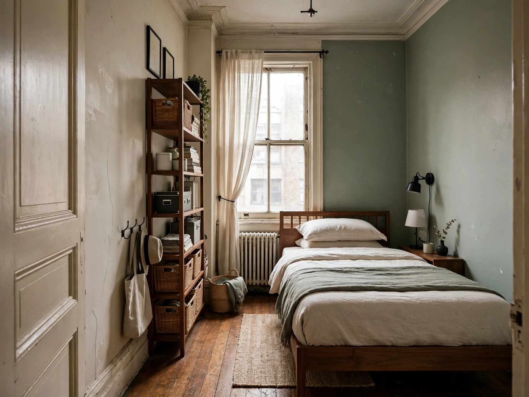
Small Bedroom Ideas: A Complete Guide to Layout, Storage, Lighting & Style
A practical small-bedroom design guide built around floor planning, circulation, storage, lighting and the details that make a compact room feel calm instead of crowded.
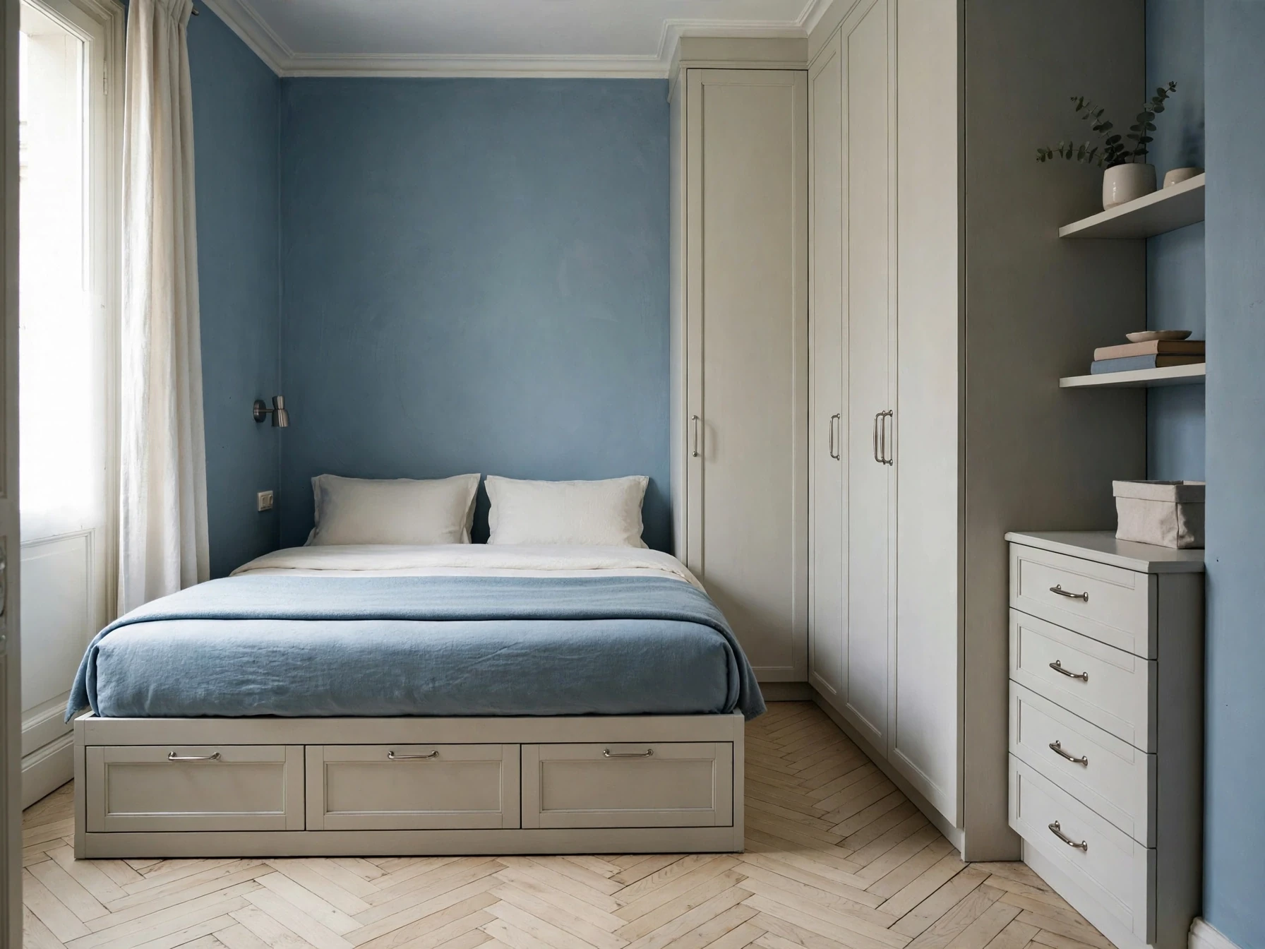
Small Bedroom Storage Ideas: A Practical System for Finding More Space
A storage-first guide for small bedrooms, with a simple system for deciding what belongs under the bed, beside it, on the walls, inside the wardrobe and out of sight.
Small Bedroom Layout Ideas: How to Plan the Bed, Storage and a Desk
A practical floor-planning guide for small bedrooms, including queen-bed layouts, narrow rooms, one-sided access, wardrobe clearance and bedroom-office combinations.